Events

Klein Residence Open House

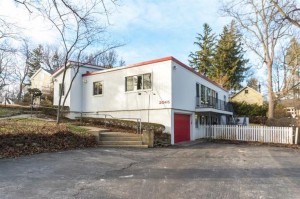
There will be an open house on Sunday, June 11th from 11:00 AM to 1:00 PM at 3087 Overridge Road in Ann Arbor Hills. Tickets can be purchase here.

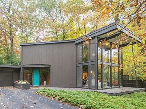
This beautiful home was designed by Edward Olencki in 1962 for the Engels and purchased by the Kleins in 1989.

Once she found herself inside this extraordinary hilltop house, Sally Klein was sure it was for her. Leaving behind their beautiful place in the country (actually Irene Olencki sold their house for them), the Kleins moved into 3087 Overridge Road in 1989. The previous owners kept the house in immaculate condition, so very little needed to be done to accommodate her family. She said that husband Tom, a mechanical engineer, took a little more time but he eventually came around to loving this Midcentury Modern masterpiece (1962) by Edward Olencki, one of three residences designed by him in Ann Arbor.

Edward Olencki came to the College of Architecture and Design at the University of Michigan in 1948, having graduated from Illinois Institute of Technology. He had worked as a draftsman and designer in the office of Mies van der Rohe in Chicago from 1943 to 1948. At Michigan he taught courses in construction materials and methods, comprehensive architectural design, and furniture design. He also ran his own architectural firm, designing homes, churches, and commercial buildings.

The Klein House on Overridge is barely visible from the street, but the ascent up the driveway instigates an Oh My Word! sense of an unfolding palace, white, somewhat austere, rising up a cliff face. The open garage leads the eye to take in the layered forms of courtyard wall, first level, second level and additional chamber farther back. And the house is sited so it’s impossible to comprehend the full scale of the house as it reaches into the surrounding ridge and trees.

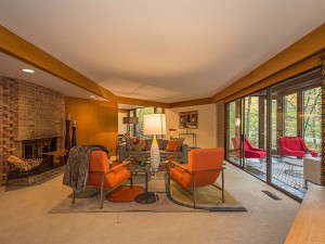
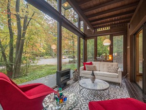
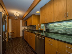
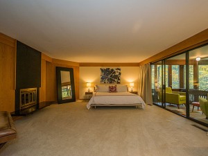
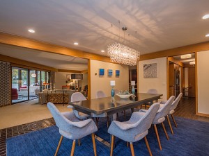
Sally Klein made the comment that in the case of this house the outside is more important than the inside. She was referring to the dramatic site but once inside and having climbed the stairway to the main level, the interior dimensions convey an airy feeling of openness and light. Placed on a north south axis, three large rectangular areas accommodate sleeping quarters, living room, and kitchen dining room. On the north end a screened porch looks over a saddleback horizon into forest trees. The detailing in the house, which has remained intact (except for the removal of one bookcase to downstairs and modifications in the kitchen), employs light-toned wood surfaces and large windows. The predominately white interior with black accents adds to the serenity of these light-filled spaces.

For the walkway to the house itself, Sally traded out concrete steps for large granite stepping stones, which better complement the approach to porch area and main entrance. No description can realize how this house takes hold of the imagination. It embodies the essence of Midcentury Modern house design in its use of site, simple materials, elegant proportions and landscaped setting. This is a wonder filled house.

At UMMA – The Michigan Union and the Michigan League – through May 7th

Author: Jeffrey Welch

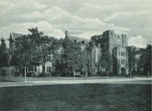
Here at the Bentley Wall in UMMA, one may pass an agreeable hour perusing photographs, drawings and collectibles related to two of the finest and most familiar buildings on the Michigan campus. Find Level 3 in the new wing of the museum to view the show “Constructing Gender: The Origins of Michigan’s Union and League.”

The Bentley Library in conjunction with the museum has brought together a visual narrative highlighting the Michigan Union and the Michigan League buildings in the context of their functioning as sanctuaries for men and women, who at the time were far away from home and campus bound. Nancy Bartlett, Associate Director at the Bentley and responsible for this exhibition, one of the Bentley’s contributions to UM’s bicentennial celebration, introduced the show on Sunday, February 19th.

Screen Shot 2017-04-05 at 10.01.14 PM

Michigan League

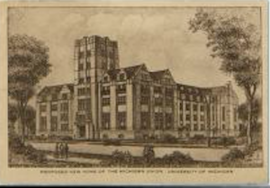
In her presentation (which one hopes will become a collectible pamphlet/catalogue) Nancy Bartlett explained that both buildings originated from the same architecture office, Pond and Pond. And they conformed to gender roles largely defined by the Pond brothers. In a nutshell, the Union shielded males from female scrutiny. It provided a democratic gathering space open to all the university men and not just to club men. In contrast, the League provided gathering spaces where activities could incorporate a desired male participation. The Union was given wide halls, colorful decoration, a billiard room and a swimming pool (open to women from the beginning but with restrictions). At the League, many generous-sized rooms for female and male gatherings opened on the narrower corridors, though some rooms, like the large Hussey room, were for women only. Also, a theater for university productions, given in memory of Lydia Mendelssohn, enriched its cultural attraction.

Screen Shot 2017-04-05 at 10.00.29 PM

Michigan Union

The Pond brothers earned their degrees in the late 1870’s at UM under supervision by architect William Le Baron Jenney, and they located in Chicago at the time W. L. B. Jenney was inventing the steel skeleton for the skyscraper. At Michigan, the men had no place on campus to gather or socially to meet with professors or to share a meal. Hence, the drive to build a Union building with a dining room. With their numbers ever increasing, the university women and alumnae wanted (and quickly acquired) a League of their own. By 1922, when the League was in planning, the campus had been given zones along the State Street axis for buildings, with athletics and literary buildings on the south and west and science and women’s buildings on the north and east.

On the Bentley Wall, photographs of the Pond brothers, the long-lived Union doorman, and interiors with students disporting themselves are mixed with elevation drawings, an exquisite drawing of a custom-designed billiard table, and collectible objects in display cases. On one side, dance cards show how seriously students prepared for and pursued the many social activities located in these buildings. The other case displays postcards that served to spread the images of the Union and League buildings, creating icons for “The University of Michigan” that became familiar to people all over the world.

This show is one in a continuing series on architecture, devised by the Bentley Library to enrich understanding of university and Ann Arbor history within the context of developing ideas of modern architectural practice. The Pond Brothers were modernists in their time, and this show gives a delightful glimpse into the nexus of architecture and social life at the university. It is a charming show, one not to be missed.

Book Signing on March 20

We are extremely delighted to welcome and host Brian Conway, the State of Michigan Historic Preservation Officer, to talk about and sign copies of Michigan Modern:  Design that Shaped America, the beautiful book that he and his colleague Amy Arnold have edited.   Our reviewer has found the book to be engaging and an essential resource of Michigan’s modern architecture and design. Read our review.

Brian will be speaking on March 20 starting at 7:00 p.m. at the Ann Arbor District Library, Main Branch, located at 343 S. Fifth Avenue.

Please join us for a stimulating discussion of Michigan’s world-class legacy of modern architecture and the chance to meet Brian and Amy.

If you have any questions please contact us.


20th Century Architecture, Furniture and Finishes

Start date: 03/21/17

Molly Osler teaches this class which is for anyone interested in 20th century architecture and design. 
It investigates mid-century modern design with an emphasis on historical aspects of domestic surroundings,
including an investigation of the Bauhaus School and its influence on 20th and 21st century architecture and interiors.

Free Metcalf Open House

An open house will be held on Sunday, November 6 from 4-6:00 PM.

Realtor Anne Gilbert has invited friends of a2modern to an exclusive open house in this gorgeous Bob Metcalf home at 3965 Penberton, which she has just listed. It is an example of Metcalf’s mature style, as he had been designing homes for 25 years when he created this residence for the Eugene Claey family in 1978.

No need to sign up, just come.

This mid-century modern home is one of the most striking examples of Metcalf’s highly prized design aesthetic. An open floor plan for easy family living and gracious entertaining is complimented by extensive walls of glass, creating a sense of indoor-outdoor harmony in every room. There are two fireplaces, one in the living room and another in the master bedroom, along with oak paneling and built-ins throughout. Meticulously maintained and updated to preserve the design integrity, this home includes a thoughtfully updated kitchen with refinished original cabinets and Samsung appliances. Recent improvements include slate entry and planter box, updated lighting, new carpet. interior and exterior paint. Outdoor living spaces include a four-season room, re-built and expanded deck, and enclosed balconies. The home is located on a quiet cul-de-sac in a private wooded setting within walking distance of King Elementary and easy access to highways, Medical Center and North Campus.


Techbuilt Open House

An open house will be held on Sunday, October 2 at 1 PM, 2 PM, and 3 PM.

Techbuilt homes are considered the best of the many prefab houses that were developed to help solve the post- WWII home shortage.  Created by Boston area architect Carl Koch, a modernist who had studied under Gropius and Breuer, his design was a simple and inexpensive two-story bi-level house that could be built in a few days and added to when the family grew. Anitra and Jesse Gordons’ home, built in 1955, is one of the first built in Ann Arbor.

Click here to purchase tickets to the event.

The Gordon house on Chalmers Drive sits on the crest of a gentle ridge nestled in an encircling forest setting. On one side, steps descend to a swimming pool, open to the sky; on the other, a thick growth of tall trees provides a sheltering canopy for a spacious screened-in porch. This is a perfect site for a Techbuilt house, whose modern design allowed for ample light, open interiors and a settled-in-the-earth feeling.

Techbuilt, the brainchild of architect Carl Koch, solved two problems for homebuilders—wasted space in the basement and unusable space in the attic. By sinking the foundation a half story in the ground, the basement became the first floor. The second floor then rises to the pitched roof, whose gentle incline creates the dual effect of a cathedral ceiling in the center of the room and attic eaves at the edges. Because the barn-like frame of the building carried the weight, it was easy to install the standardized pre-fabricated wall panels and windows. Once the foundation was poured, the shell of a Techbuilt house could be put up in two days.

The Gordon house reveals the many strengths of the Techbuilt concept. Structural features—post and lintel framing, a roof visibly supported by solid but slender wooden beams, wall panels and windows placed to provide light or privacy, and an open interior wall-to-wall—present the durable, rational design elements typical of the original building. More recent modifications and additions demonstrate the flexibility of the original design, such that the four major additions authorized by the Gordons extend and cooperate with the lines of the existing structure. The large screen porch built over a wooded outlook, for example, continues the roofline in a natural extension, its gentle angle creating a cozy feeling in an open and airy space.

The Gordons are the fourth owners of the house. The second owner put in the swimming pool. Outside the house, one path leads to a short walk to Mallett’s Creek and another walk meanders in the densely wooded area nearby, accentuating the cabin-in-the-woods feel of the site. An original carport blocks the house from any view from the street. As with modern houses, the original entrance to this house was designed not to be immediately obvious to a visitor, and when you stepped in you could go up or down stairs. The Techbuilt design was the forerunner of the split-level house. These houses have a sleek, modern look and two levels of windows. Balconies could be added on, either on the ends or along the sides, and as for furniture, Carl Koch designed Techbuilt Spacemaking Furniture for those who found conventional furniture ill-adapted for use in these houses. Koch’s book, At Home with Tomorrow, catches the spirit of those days just on the verge of the Space Age and an encounter with a Techbuilt house provides an indelible insight into a vision for affordable living carried to an exceptionally detailed and successful resolution.


Written by Jeffrey Welch

Law Library Tour

On August 21st at 2 PM there will be a rare chance to see the University of Michigan Law School addition.

Almost entirely underground, yet light and airy, Gunnar Birkert’s 1981 law library addition is an amazing feat.   The law school desperately needed more space for a library, yet were loath to build anything that would impair the look of their 1920s neo-Gothic buildings. Birkerts solved the problem by building a structure three stories underground, lighted by V-shaped troughs that bring in light from several directions, aided by the limestone base that reflects light and the mirrored window frames. Not open to the general public, this is a unique opportunity to see the underground library, led by Margaret Leary, Director of the Library when the addition was built.

For tickets go to http://www.a2modern.myevent.com/

Livingston Bandemer/Mirsky Home Tour

August 14th at 1 PM, 2 PM, and 3 PM. This is one of several homes designed by architect James Livingston in the Arbor Hills neighborhood. It is newly restored by John and Renate Mirsky and recently featured on a tour during the national Docomomo convention, which explored modern architecture in the Detroit area. Tickets can be purchased at http://www.a2modern.myevent.com/


When John and Renate Mirsky were searching for a new home, they were not specifically looking for a mid-century modern one, but “spotting the listing in an emailing, I immediately recognized that the house fulfilled all of our priority wants,” remembers John. Their wish list included large windows to let in the sun, an open floor plan, and room for a garden.

The home was built in 1956 for William and Mary Bandemer. William was vice president of King Seeley and a Republican city council member from 1960-1964. Before marriage, Mary had been secretary to long-time mayor William Brown. The house was designed by James Livingston, who at the same time did one next door for Mary’s older sister, Margaret, and her husband Paul Greene. The two houses share a driveway and are both MCM but are quite different, although they share some traits like cove lighting and the same woodwork inside.

When Livingston designed the Mirskys’ house he was in his mid-thirties and moonlighting from his day job working for architect Walter Anicka. Joining with Bob Chase, another Anika employee, they worked evenings and weekends on their own projects. According to Chase, Livingston was the driving force, making the initial contacts and finding out what the clients wanted. Livingston clearly didn’t do cookie cutter houses, as reflected by the two sisters’ houses, but his designs were always modern. “All of Livingston’s houses were contemporary, with lots of daylight. He did nothing old-fashioned, he wouldn’t waste his time,” says Chase, adding “It was a lot of fun working with him, he was so imaginative.” Livingston went on to start his own firm and work on larger projects including the Bell Tower Hotel, Webers, Lawton school, and Maynard house. He is best remembered as the architect of Lurie Terrace, a pioneering project to house active seniors.

John and Renate moved in the summer of 2015 after spending a year and a half working on the house. They kept the original materials whenever possible or, if not, by using compatible replacements. They refinished all the woodwork and cleaned the metal hardware used throughout the house which often entailed taking things apart. Keeping an open feeling they have furnished the house with MCM furniture such as Herman Miller, Saarinen, and Eames. At the same time as meticulously keeping the Mid Century Modern ambience,they have made the house more energy efficient with a geothermal furnace, tripled glazed windows, andinsulation above the ceiling and in the crawl space.

Enthusiastic gardeners, they are using the original landscape plans by Edward Eichstadt, a Detroit-based landscaper whose projects included Cranbrook, the GM Tech Center and the basic plan for U-M Botanical Gardens, as a basis for future changes. The land sloping down to Hill Street is a natural area, perennial gardens and raised bed vegetable gardens are on the side, and fruit trees in front.

Wells Bennett / Barbara Bergman Open House

Saturday, May 14th, at 2 PM, 3 PM and 4 PM

This is the first modern home that Wells Ira Bennett designed, although at that time, 1953, he’d designed almost thirty houses in more traditional styles. He is best remembered for hiring a group of stellar modern architects while dean from 1938 to 1957 of U-M’s College of Architecture.

Bennett arrived at U-M in 1912 as an instructor and rose to leadership through his early interest in low-cost housing and city planning. As a practicing architect, Bennett was active after 1921, developing a considerable residential practice, mainly with faculty clients.  His first project was a home for himself and his family at 500 Highland. He kept busy in the 1920s and early 1930s, designing homes in the styles of the time, mainly Tudor and Colonial Revivals.  He stopped during the Depression, when few could afford to build, and then became too busy in his years as dean.

Taking over the deanship from Emil Lorch, he followed Lorch’s example of encouraging new ideas and modern styles.  He invited many of leading architects of the day to participate in seminars and conferences.  After WWII, he began hiring some of the stars of  Modernism, luring both Walter Sanders and William Muschenheim from successful practices in New York City, and Edward Olencki and Joe Albano, both of whom studied under and then worked with Mies van der Rohe, from Chicago.  He also hired talented U-M grads such as Robert Metcalf and Tivadar Balogh.  These hires not only brought prestige to the U-M architecture school but built many fine examples of modern architecture in the Ann Arbor area.

In 1953, as Bennett was nearing retirement, and after a long hiatus, he designed a house, this one again for himself.  He sited it on the front lawn of his first house, on land that sloped down to Geddes.  Although this was his first modern house, he had by then seen many examples from the rest of the faculty and of course had a dream group of colleagues to advise him if he had questions. Bennett died in 1966.

Barbara and Rueben Bergman bought the house in 1980 from Sybil Bennett’s estate and moved in with their three sons. They made the house their own –enlarging windows, reconstructing the side balcony so it would be safe, enlarging and improving the master bathroom, making a closet out of a hallway for more storage, while still keeping the totally modern feel and in fact improving it with more natural light pouring in. The most interesting change is a small room with a tower added to what was basically a galley kitchen.  Designed by Janet Attarian, it not only makes the interior feel more roomy, but gives the outside of the house more pizazz.

For tickets go to a2modern.myevents.com

Grace Shackman and Jeffrey Welch.

Photo courtesy of Carolyn Lepard