Events

Modern Cuba Encore

Back, by popular demand –


Modern Cuba:  Slideshow by Howard Shapiro

May 7, 3-5 PM:  Slide show starts promptly at 3:30 PM

Cost: $15: Proceeds will go toward upgrading our website.


Last October Howard participated in a do.co.mo.mo-US sponsored tour “Modern Cuba.” The architecture of Havana from the colonial area to the present was surveyed with an emphasis on the modern era prior to and following the revolution, including interior visits to numerous structures not open to the general public. Howard’s slideshow demonstrates the relationship of changing architectural styles to corresponding social changes and major historical events. Highlights include the Tropicana Cabaret (Max Borges Recio, 1951-1956), the Alfred de Schulthess House (Richard Neutra, 1956), and the National Art Schools (Ricardo Porro, Vittorio Garatti and Roberto Gottardi, 1960-1964).

To purchase tickets go to a2modern.myevent.com

Modern Cuba

Modern Cuba:  Slideshow by Howard Shapiro in his 1965 Alden Dow house, 7 Regent Drive

April 16, 2-5 p.m.:  Slides at 3 with tours of the house before and after.

Cost: $20: Proceeds will go toward upgrading our website.


Last October Howard participated in a do.co.mo.mo-US sponsored tour “Modern Cuba.” The architecture of Havana from the colonial area to the present was surveyed with an emphasis on the modern era prior to and following the revolution, including interior visits to numerous structures not open to the general public. Howard’s slideshow demonstrates the relationship of changing architectural styles to corresponding social changes and major historical events. Highlights include the Tropicana Cabaret (Max Borges Recio, 1951-1956), the Alfred de Schulthess House (Richard Neutra, 1956), and the National Art Schools (Ricardo Porro, Vittorio Garatti and Roberto Gottardi, 1960-1964).

To purchase tickets go to a2modern.myevent.com


Lecture: Gunnar Birkerts: The Work Speaks for Itself

In his talk on March 1, Martin Schwartz will discuss his first conversations with Gunnar Birkerts about his work, researching in the Birkerts collections at the University of Michigan Bentley Library, and how this led to the book, Gunnar Birkerts: Metaphoric Modernist.  He will concentrate his remarks on his and Gunnar’s shared interest in how architecture and daylight work together to make great spaces and enhance the experience of architecture, ideas that Gunnar addressed throughout his professional career.

The lecture will take place on March 1, at 7 PM in the Whiting Room of the Bentley Historical Library, at 1150 Beal Ave., Ann Arbor, MI  48109.

Martin Schwartz is an architect as well as an Associate Professor and Associate Chair at the Department of Architecture at Lawrence Technological University.  He is the author of the architectural essays in the book, Gunnar Birkerts: Metaphoric Modernist (2009), an anthology of the architect’s career in design.

Martin’s research concerns daylight and its broad influence on architectural and urban design, specifically how a knowledge of daylight enables architects and urban designers to make a range of design decisions far beyond meeting minimum illumination standards.  His current scholarship focuses on how daylight influences the making of architectural space and form.  Martin writes a blog about daylight, Architecture in the Light of Day, which may be found at www.architectureinthelightofday.blogspot.com/.

Martin was the Willard A. Oberdick Fellow at the Taubman College of Architecture and Urban Planning at the University of Michigan in 1991-1992.   In 1994, he was the Frederick Charles Baker Distinguished Professor in Lighting at the Department of Architecture at the University of Oregon.

Brigham's Hodges / Conlin Open House

Open house on Sunday, October 18 / 1PM, 2PM, 3PM


We are hosting our first ever tour of a home designed by George Brigham on October 18. Tickets are $15 and may be obtained at http://www.a2modern.myevent.com/ .

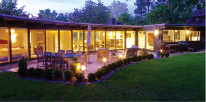
When Chris Conlin bought this 1956 George Brigham house 18 months ago, it still had its beautiful clean mid-century modern lines, but was almost 60 years old and needed attention.  Chris kept the footprint and exterior exactly as it was, but did extensive work inside to update it and make it his own.

The house’s architect, George Brigham (1899-1977), is considered Ann Arbor’s father of mid-century modernism.  He trained at MIT in the prevailing Beaux Arts style, but when he taught at Cal Tech he became interested in the architecture emerging in California, especially homes by Greene and Greene, Schlindler, and Neutra.  When he came to U-M in 1930, he was anxious to work in the new style, although it took a few years to get commissions since it was the midst of the Depression. He ended up designing 66 buildings in the Ann Arbor area, concurrently with teaching. He was a champion of this style, often giving speeches on its virtues.  He was also interested in social issues and worked on developing affordable housing and temporary shelters.

Highland Lane’s development was a joint project of Brigham and his wife Ilma with Madeline and Fred Hodges, the latter chair of the U-M radiology department and an assistant dean in the Medical School.  In 1957 the two couples bought from Margaret and Robert McNamara (soon to be U. S. Secretary of Defense) a parcel of land that ran behind Highland Street and was part of the grounds of their house at 210 Highland.  The Brighams and Hodges put in a road and installed utility lines prior to selling lots.

The Hodges kept the two end lots for themselves while the adjoining ones were sold to Richard and Ann Kennedy and to Charles and Katherine Sawyer.  Brigham designed houses for all three couples,  taking care to position them so they couldn’t see into each other’s homes.   A fourth house was later designed by David Osler, following the deed restriction that all homes had to be designed by an architect.

Chris is happy that he was able to buy the Hodges house, fearing that someone else might have bought it just for the lot, which is in a prime location near campus.  “I’ve kept the modern feel, I’ve nothing ornate,” says Chris, explaining his guiding principal on what turned out to be a year-long job, including putting in new wiring, air conditioning, and insulation.   He kept the original windows and skylights so the house if full of light.  The original fireplace is still the heart of the house. Chris took down several walls which add to the free flowing modern look including making two bedrooms into one, moving a free standing hall closet out of the way, and opening up the kitchen.  He added more storage to keep down the clutter and put in light trays on the living room ceiling so no lamps are needed.  He has followed this aesthetic by choosing furniture with clean lines.  Chris cleared out the overgrown backyard, so the windows now look out on grass and trees and the new patio.

written by Grace Shackman

Huget Open House


There will be an open house and tour at the home of Lesa and Michael Huget on Sunday, September 13th. Tickets are $15 and may be obtained at http://www.a2modern.myevent.com/ .

“The house is most desirable for its fine stand of evergreen trees and view over Barton Pond,” wrote Robert Metcalf, describing the home he designed in 1955.  It was only his seventh house, but already he had developed the skill of siting buildings on difficult pieces of land. “Sloped up quite steeply from the street in a rough bowl shape, the area where the building was possible was quite small,” he explained. Metcalf decided to nestle the house up against the trees with a view down to Barton Pond to make it seem like a “lake cottage year around.”

His clients were Jessie Forsythe, founder of the Forsythe Gallery, the first art gallery in town, and Franklin Forsythe, a lawyer, who had very specific ideas of what they wanted. The living room, dining room, and kitchen that flow into each other and look out on to Barton Pond, were designed as a “dignified, gay, open space for casual entertaining,” per the Forsythe’s request.  The master bedroom looked out on to a patio.   Their two sons’ basement bedroom had direct access to the car port so they could pursue their hobby of working on cars.  Since Jessie had originally wanted to have her art gallery in the house, Metcalf created space for one, also in the basement, with a separate entrance. (When zoning laws prohibited this she opened it in Nickels Arcade.)  The walls throughout the house were painted white to show off the Forsythes’ personal art collection of paintings, ceramics, and sculpture.

By the time Lesa and Michael acquired the house two years ago, it had been altered in unsympathetic ways by interim owners and also showed the signs of almost 60 years of wear, but they could see the bones of a dream house and were happy that they were able to purchase it instead of a second bidder who wanted to buy it for the view and tear it down.

The Hugets hired architect and U-M professor Craig Borum to help them bring the house back to what it could be. Borum had been a student of Metcalf’s and consulted with him on the project. “With the larger ambition of preserving this legacy, the existing state of the house required both structural and aesthetic improvements” explains Borum, adding “The interventions were all executed as closely to the original plans with the additional consideration of efficiency and sustainability.” Borum received an honor award from the Michigan American Institute of Architecture for this project.

They started by removing the overgrown vegetation in the front yard, which was so high that the house was advertised as having “seasonal views” meaning that the pond could only be seen when the leaves were off the trees. The next job was to repair the deck on the front of the house so they could enjoy the view. “It was scary,” says Lesa.  “It was slanted and you could see down to the ground.” They extended the deck to the side of the house and brought the railing up to code by making it higher. Inside, they took out several levels of flooring and replaced it with cork, which is soft on feet and very sustainable.  In the living room they took out the later addition of a traditional fireplace mantle to reveal the original marble one.  The walls, which had aged to a dull white, were re-painted throughout by Kate Lazuka in period-appropriate colors that make the beauty of the rooms pop out.

The biggest change was in the lower level rec room, which “didn’t even feel part of the house,” according to Lesa.  But new paint, an added window, period-inspired built-ins designed by Craig Borum, and period appropriate furniture brought it back to what it could be.  Lesa knew they had succeeded when a contractor said “It makes me want a martini.”


Balogh / Nagy Open House

There will be an open house at this unique home on August 9th. Tickets for the 2 PM or 3 PM event are $15 and may be obtained at http://www.a2modern.myevent.com/ .

Think of a 90° angle tilted left 15° and you have the framework for this 1968 house. “With limited resources we certainly got an unusually interesting house,” says Andrew Nagy, who with his then-wife Joan Nagy, hired modern architect Tivadar (usually called Tiv) Balogh to design a house on a lot that they had purchased in Huron River Heights.

Neither of the Nagy’s had much experience with houses—Joan was just 22 and Andrew had always lived in apartments, so they were open to new ideas. “When he [Balogh] said he had always wanted to build a trapezoidal house we said ‘why not?’ We loved the way the house turned out,” says Joan. Balogh had been in private practice just six years when he accepted the Nagy commission in 1967. Prior to that, he had worked six years as a draftsman for Robert Metcalf, another U-M architecture school graduate who was also a modernist.

The Nagy’s developed a close working relationship with Balogh, who they came to admire and like. After tweaking the plan to their liking, Balogh oversaw the construction. At first the Nagy’s did not think they needed eating areas in both the kitchen and dining room, but Balogh convinced them otherwise. “He said his kids were in the ‘food throwing stage’ and that a separate area was needed,” recalls Andrew. The plan had an option for a copper roof, but that turned out to be equal to the cost of the rest of the house, so they substituted cedar shakes.

Balogh achieved both privacy and light for the house by having the roof go all the way to the ground on the driveway side and putting large windows on the front and back. The Nagy’s loved the fireplace that Balogh designed for them. Made with Chicago common brick, which are smaller and a lighter color than traditional ones, it’s the focal point of the living room and goes up two stories.

In the ten years they were in the house, the Nagy’s made only one major change, which was to enclose the balcony in their bedroom. Joan liked being able to see out part of the living room windows, but when their children got to the age when they liked to jump on the bed, both Nagy’s worried about whether it was safe.

When the Nagy’s needed more room they thought of adding on but found it too expensive, so they hired a builder to construct another house for them. They were able to replicate the fireplace in their new home, but other features like the vertical grained wood doors and tongue in groove cedar proved to be too expensive by then.

Kelly Salchow MacArthur, the present owner with her husband Jay MacArthur, has the same positive opinion of the house that the Nagy’s had. “It’s mid-century but not low and flat,” she says, adding “I like the angles, the way the rooflines affect the rooms. I love the interesting way the built-in shelves mimic the outside proportions.” She and Jay have kept the modern look by not over furnishing the house, an endeavor helped by the fact that there are many built-ins. For new furniture they have focused on the classics such as Eames and Bertoia. Kelly’s design work hangs throughout the house. Be sure and note the mailbox in front of the driveway that she designed to relate to the house.


.written by Grace Shackman


New David Osler Tour


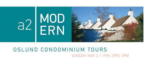
On Sunday afternoon, May 3rd, there will be three tours of the Oslund condominiums here in Ann Arbor.

The cost of the tour is $15 per person. To register click here: http://www.a2modern.myevent.com/

Oslund was David Osler’s most personal work after his house and office. Located on what had been
his family’s farm, he cared deeply about the site and was in total control of the design. The resulting
project, 27 condominiums built in three phases between 1987–2005, was designed for clustered
density, yet each unit is totally private. “He did Oslund for himself, it was a whole different concept,”
recalls Connie Osler, David Osler’s widow.

Osler (1921–2014) moved with his family to the farm when he was four years old. When the
Depression hit they were able to survive by supplementing his father’s income as county agricultural
agent with the farm produce. Scott Van Sweringen, the architect who was project manager on the
first phase, remembers that by the time they began the project “the land was mainly scrub grown
over, but we looked to see if there were trees to save.” They did find some birches that were
incorporated into internal gardens and still are there. They also saved pine trees that Osler and his
brother Scott had planted.

The units in the first phase are entered through the first of the three gardens, into a low entrance,
leading past a galley kitchen, into a cozy dining room that looks out onto the second garden, and
then up three steps to an elegant high-ceiling living room surrounded with a garden on two sides.
Helen Aminoff, long time Osler business manager and a resident in one of the first phase condos,
describes the units as “opening up like a flower,” to which Molly Osler, Osler’s daughter, adds, “you
experience it as a series of events.”

Minor changes were made in the second phase units including moving the location of the stairs to
the basement thus creating a larger kitchen and removing the steps to the living room, a request
from people interested in aging in place.

The condos were carefully designed to fit the site. The steep-roofed garages, which front the units,
are in a stepped-up pattern following the rise of the land. “It’s more interesting than if they were just
lined up,” says Van Sweringen. The basements were dug and then the ground filled back in for the
gardens. Because of the various stages of the projects, Van Sweringen recalls that they had to call a
surveyor in several times, and adds “the visual interest came with a  price.”

Privacy also was carefully thought out. “You can’t see into windows, they are visually restricted, it
took great effort to do this,” explains John Miller, builder on the last two phases. “The gardens
extend the living space,” explains Jim Scrivens, the architect who was project manager for the
second and third phases. “With the high density, they needed outside space to look out at, plus
it created natural light.” The three gardens are enclosed by high brick walls, making window
blinds unnecessary.

The design of the gardens was left to the residents and varied from rose gardens to vegetable ones
and everything in between. Some people put in decks. One requested a sunken pool. The plants for
the exterior landscape, Amur maples and ground cover and shrubs, were selected by landscape
architect Chuck Cares. The two roads were named Scott, after Osler’s brother, and Young, his
mother’s maiden name.

The “os” in the name is of course from Osler (pronounced with a long o), while “lund” is the Swedish
word for wooded glen. The Scandinavian influence is most noticeable in the painted white brick and
the internal gardens. “They had beautiful little towns,” recalled Osler in a 2012 interview. “The
buildings were simple, straight forward. I learned a tremendous amount.” In the same interview he
said of Oslund that he particularly liked the “angles and gables, creating sharp shadows,” adding, “I
love it when it’s crisp.”

The units in the first phase were the hardest to sell. “Those who could afford them were used to
more conventional houses and had trouble seeing themselves in that environment,” recalls Van
Sweringen, “while younger people liked it but they didn’t have the money.” The worsening economy
added to the troubles, as did problems with visualizing the final product which potential buyers had
to imagine from models and house plans. Complaints included the lack of a picture window in front,
the size of the galley kitchen, and the lack of a long view. But those with imagination could order
finishes they wanted. One wanted stone floors throughout, others wanted different fireplaces. The
space above the garage was left unfinished so each occupant could decide its use such as office,
exercise room, art studio, or guest bedroom.

In the second phase, because they were pre-sold but could see the finished products in the earlier
phase, a number of changes were made on request such as moving walls to give a more open
feel, changing the kitchen layout, and basement finishes. Because of the city’s desire for a smaller
footprint and the lay of the land, Osler was able to design the phase three units as two stories, some
with an exposed basement, allowing more daylight into that area.

Today the units sell almost as soon as they hit the market, often at prices higher than the listing.
Photo: Courtesy of Bentley Historical Library.


Birkerts at the Bentley Historical Library

“One of the great American Modern architects of the last sixty years,” is how Sally Bund describes the man whose papers she has been curating at the Bentley Historical Library for the last twenty years, working closely with him. She will give an overview of Birkerts’ work, which is international in scope, including most recently the Latvian National Library. She will be joined by Margaret Leary, retired director of the University of Michigan Law Library, who was involved in the planning and design of Birkerts’ pathfinding underground addition.

Birkerts follows no set of rules but designs every building for its specific site and use. He is particularly well-known for his innovative and sensitive use of light, which is well-demonstrated in his two Ann Arbor buildings, the University Reformed Church (with its indirect lighting) and the University of Michigan Law School Library Addition (which is filled with light despite being below ground).

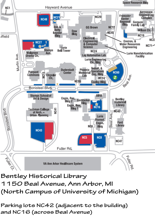
The Bentley Historical Library is located at 1150 Beal Avenue, Ann Arbor on the University of Michigan’s North Campus. A map is attached, indicating the locations of the closest lots where free parking is available. Please contact Grace Shackman by email at gmshackman@comcast.net or by phone at 734-662-2187 if you would like any additional information.

Date/Time
Date(s) – 02/04/2015
7:00 pm – 8:30 pm


Last walking tour for 2014, Sunday September 14th-SOLD OUT!

map

Join us for the last walking tour of the year. The tour will be Sunday September 14th from 1:00 p.m. to 2:30.
Ann Arbor Walking Tour III Sunday, September 14, 1:00 p.m.-2:30 p.m.

This event has limited space availability. Cost: $10/person. Registration is required.

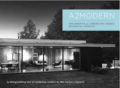
This walking tour will look at several modern homes located in one area of Ann Arbor Hills. The tour will view the exteriors of homes designed by Robert Metcalf, William Muschenheim, Edward Olencki and Joe Albano and David Osler. It will provide a historical overview of the area and will include an interior view of the Robert and Bettie Metcalf residence (1952). The walking tour will be lead by Nancy Deromedi and Grace Shackman.

a2modern is a local 501 (c)(3) organization dedicated to the awareness of and appreciation for mid-century architecture and design, celebrating the accomplishments of the architects, designers, builders and homeowners in Ann Arbor. UMMA is pleased to partner with a2modern to provide audiences the opportunity to experience Ann Arbor’s modernist architecture in conjunction with the exhibition Three Michigan Architects: Part 3—George Brigham on view July 19 –October 12, 2014.

The exhibition Three Michigan Architects: Part 3—George Brigham is part of the U-M Collections Collaborations series, co-organized by and presented at UMMA and designed to showcase the renowned and diverse collections at the University of Michigan.

LOGISTICS: We will meet in front of 910 Heather Way. You can park on both sides of the street.

Questions? email modernists@a2modern.org