Research Articles

Metcalf Modern

Author: Grace Shackman


In the 1960s, U-M Profs sometimes waited years for architect Bob Metcalf to design their homes. Now his mid-century designs are back in fashion.

Bob Metcalf, at age eighty-seven, is adding a two-car garage to his house on 1052 Arlington. He already has a one-car garage and isn’t currently driving, but he’s building it now because he can’t bear the thought of a later owner doing it badly. “I figure they would wreck the house by putting the garage right out in front,” he explains.

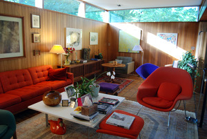
The house is very special to Metcalf‹he and his late wife, Bettie, built it themselves in 1953. Using it as a showcase, he went on to design sixty-eight houses in Ann Arbor. All are in the style now known as “mid-century modem,” and, after a period of being ignored, are treasured by a growing community of admirers.

Metcalf’s new garage is a little south of the existing home so it doesn’t interfere with the entrance. The original one-car garage on the other side of the house was the first thing that the Metcalfs built in order to have a place to store their tools during construction.

Bettie Metcalf found a large lot in the then-unsettled Ann Arbor Hills, just outside the eastern city limits. (The subdivision was laid out in 1927, but very few houses were built during the Depression and World War II.) Bob Metcalf spent a year drawing up the house plans. They started work in April 1952 and moved in just over a year later.

At the time, the U-M architecture grad was working as a draftsman for George Brigham, one of the first architects in the area to odern-style houses. Metcalf would work for Brigham from 6 a.m. until 2 p.m. and then head over to the construction site. Bettie would join him at 4 p.m. after getting off from her nursing job at the University of Michigan Health Service. She would bring the supper that she had made the night before, which they would eat sitting in the car.

They did all the labor themselves except the work required by law to be done by specialists, such as electricity and plumbing. Design decisions were based on aesthetics, their skills, and what they could.afford. Metcalf didn’t know how to plaster, so he made the interior walls out of cedar (relatively cheap then). He got the idea of putting in a brick floor from a friend who had done that for a project with Alden Dow in Midland‹according to Metcalf’s construction journal, he paid five cents a brick.

Homes that George Brigham designed were filled with light coming in from large south-facing windows. Metcalf made his windows even larger and angled them more to the southeast‹an orientation, he says, that lets in “less sun in summer but [more] heat gain in winter.” Like most mid-century modem designs, the house has a flat roof. Rainwater drained into the backyard through an interior pipe, in effect creating a rain garden long before they be- came popular.

The couple’s work paid off. Before the house was even finished, Metcalf had received five commissions, all from U-M faculty members‹vindicating his belief that Ann Arbor would appreciate the type of house he wanted to build.

Metcalf was born in 1923 in the small town of Nashville, Ohio. His dad. dis- appeared when he was young, and his mother moved to nearby Canton, where she worked as a maid and later remarried. When Metcalf was six or seven, a visiting uncle saw the way he was playing with objects on the floor and told him “you ought to be an architect.”

He enrolled in the U-M architecture school in 1941 but was drafted to serve in WWII. He and Bettie had dated after high school, and just before Memorial Day in 1943, he called and asked her to come down to Louisiana, where he was stationed, for the holiday. When she asked why, he replied, “Because we’re going to get married.” And so a three-day engagement led to a sixty-five year marriage. Metcalf returned to the U-M after the war, and graduated with a bachelor’s degree in 1950. As graduation grew closer, Metcalf asked Brigham, a professor he thought highly of, if he could work for him. He liked the way Brigham took into account “the impact of the environment on a building,” he recalls, and was also impressed that Brigham was the only member of the architecture faculty who invited students to his house. Brigham hired him as a draftsman at $1 an hour.

After four years with Brigham, Metcalf began his own business. His first commission was from physics professor Richard Crane and his wife, Florence, who wanted a house in which they could be separated from the noise and clutter of their teenage children. Metcalf obliged by designing their home at 830 Avon with an entrance on the side that led from the left into the living room and master bedroom and from the right into a kitchen and family room, with the children’s rooms on the other end.

In addition to his architectural practice, Metcalf taught at the U-M. Within two years, he had so many jobs he asked two young U-M colleagues, Tivador Balogh and William Werner, to join him. “We worked in his own house, but it wasn’t satisfactory and after a month we moved into his one-car garage,” recalls Wemer. With only a space heater for warmth, he says, “it was so bad, it was wonderful.”

Metcalf eventually moved into an office at 444 South Main, renting the first floor from builder Zeke Jabbour. Balogh did freehand drawings to give clients an idea of what their house would look like, while Wemer did many of the calculations and detailed working drawings. When Balogh left in 1960, he was replaced by Gordie Rogers, who had studied under him. Bettie Metcalf didn’t work in the office but was always an important part of the operation, keeping the books, typing letters, and ordering furniture.

Some clients knew just what they wanted. The woman for whom he designed 2576 Devonshire, Metcalf recalls, wanted lots of white walls to display her art collection (he remembers her bragging that she had an original Kandinsky hanging above her washing machine‹and that she’d paid $25 for it in Paris). A home at 1329 Glendaloch has a center courtyard, because its first owner had seen that in South America. But Metcalf says most clients weren’t so definite, so he would interview them for several hours to get an idea of their needs: “I’d ask them how they use a house‹if they had meetings where people talked together, if they played cards, what activities they did when they had company, if they read.”

Metcalf designed houses starting from the inside. He’d block out how the rooms should be arranged, including where furniture should go. He’d figure out the best view from inside as well as how to bring in the most natural light. He often used grilles he designed to serve as room dividers. The exteriors were usually a series of boxes arranged in interesting ways, sometimes on different levels so they snuggled into the landscape. John Holland, one of the few original owners who still lives in his Metcalf house, recalls how before starting work in 1964, the architect “walked all around [the site] and thought [about] what fit naturally.”

The Holland house at 3800 W. Huron River Drive sits high on a knoll with a view of the river below. Because the knoll was flat, Metcalf stepped a bedroom up half a story to give the roof a more interesting look. The house includes many of his signature features, including a big window angled southeast, lots of built-ins including a buffet, desk, and bookcases, and careful use of wood throughout cedar outside and vertical grain fir inside. “There’s not a day I haven’t been happy to be in this house,” says Holland.

By then, the firm was so busy that another client, aerospace engineering prof Elmer Gilbert, waited several years for the architect to be available. Gilbert was single at the time; he later married Lois Verbrugge, and they still live in the house at 2659 Heather Way.

The home is more vertical than many of Metcalf’s designs: taking advantage of the sloping site, it is two stories in front, three in back. Because the street side faces south, Metcalf placed his requisite big windows on the north side, but did so in a spectacular way: they’re three stories high, and the top floor is a mezzanine that stops before reaching the windows, so light spills down to the first floor.

The siding is cedar, and the inside trim mahogany. The house is still filled with original top-line mid-century modem furniture‹Saarinen, Eames, Bertoia–which Bettie Metcalf ordered so Gilbert could get the 40 percent architect’s discount.

Metcalf varied materials and size depending on the means of his clients but never abandoned his basic principles. For instance, in 1957 he designed an inexpensive house at 2466 Newport for anthropologist Marshall Sahlins, then a low-paid assistant professor with two kids. The siding is cement block and plywood, and the inside is finished in inexpensive materials such as tile and Masonite, but Metcalf still did amazing things with siting and light. The house sits on the western edge of the property with big windows facing east giving a view of the rest of the wooded lot.

Present owners Judy and Bob Marans, who bought the house in 1974 when it was pretty run-down, have made many improvements over the years, including enclosing the foyer, adding a garage, and modernizing the kitchen and bathrooms, but they still have kept the basic structure, which they love. Judy Marans remembers thinking when they moved into the house, “When will I get used to the beauty of this? The answer is never.”

Metcalf began teaching at Michigan as a visiting lecturer shortly after he graduated. In 1958 he became an assistant professor, promoted to associate in 1963. When he was hired, he recalls, he proposed that he teach “a construction class that every student had to take. It sounds logical, but no one was doing it.”

Architects Norm and llene Tyier, who took Metcalf’s classes in the 1960s, recall that their most important assignment was to find an active construction site and visit it every day, jotting down observations in a journal. llene watched the building of the U-M’s Oxford Houses, while Norm followed an apartment being built near the Blue Front on South State. “It was one of the best things I did as a student,” he re- calls. “There was no greater respecter of Mies van der Rone’s statement that ‘God is in the details’ than Metcalf.”

In 1968 Metcalf was made a full professor and chair of the architecture department, and in 1974 he became the first dean of the newly named College of Architecture and Urban Planning. The promotions greatly reduced the time he could devote to his private architecture practice.

From 1953 to 1968, Metcalf worked on 100 jobs‹not only houses, but offices, sororities, churches (his Church of the Good Shepherd won several awards), and park shelters. Over the next twenty-three years, when he was absorbed in the work of running the architecture school, he did only twenty private commissions. “He realized he couldn’t do both at once,” explains Werner.

When Metcalf retired in 1991, he returned to his architectural practice. Werner rejoined him after he retired seven years later “It took the sting out of retirement,” he says. But while they were busy in academia, the popularity of the mid-century modem style had waned.

The simple, uncluttered look that seemed so revolutionary to their parents struck many Baby Boomers as cold and sterile. Often built on modest budgets and with a minimalist aesthetic, many homes seemed small by contemporary standards. And there was a feeling that modern houses, with their large windows, flat roofs, and easy flow from indoors to outdoors, fit better in California’s climate, where they originated, than in the Midwest.

Meanwhile, postmodernism, with its return to ornamentation, and historic preservation, which celebrated premodern styles, both grew in popularity. Though Metcalf has done thirty commissions since he retired, only three of them have been for new homes.

In the past twenty years, most of his work has involved modifying his own past designs. Holland contracted with him to build a bigger living room and later to add a bedroom and bathroom in the space between the garage and house. When Gilbert married Verbrugge, he asked Metcalf to figure out how to add a study for her on the ground floor as well as making other improvements.

Since the 1950s, home buyers have grown accustomed to more space, more bathrooms, and bigger kitchens. Over the years, many owners have remodeled their Metcalf houses. His admirers often show up at open houses when they go on the market, as does Metcalf himself. Sometimes he finds that there are no changes, but in most cases they have been modified and are often, in his words, “worse as far as I’m concerned.” When people ask, he is always willing to show them the original plans and help to do new additions or undo old ones.

Nancy and David Deromedi asked him to help with their house at 819 Avon, a 1950 Brigham design that Metcalf had worked on. The house, built for famous anthropologist Leslie White and his wife, Mary, had been modified by later owners with a snout-nosed garage extension that stuck out toward the street with a porch sitting awkwardly on top of it. When David drove up to attend an open house, he didn’t even want to stop, but Nancy convinced him it was worth looking inside.

They bought the house in 2005 and asked Metcalf to figure out how to undo the damage. He solved the garage problem by simply returning it to the original dimension. A second problem, dating to the original design, was a long outdoor entrance staircase, especially treacherous in the winter. Metcalf moved the inside entry outward, creating a well-lit foyer that covered about half the stairs.

Beyond keeping the respect of his clients, Metcalf also became friends with many of them. Holland often stopped in at his office to say hello, while Gilbert and Verbrugge periodically invite him to dinner. At Bettie’s memorial service in 2008, the room was filled with people who felt a connection with Metcalf because they lived in one of his houses.

And he’s lived long enough to see his designs appreciated by a new generation. Lois Kane, who lived in a Brigham house in Barton Hills, sees young people returning to an appreciation of the environmental and social pluses of living simply, of the “less is more” philosophy. When she and her husband, Gordie, sold their house four years ago, she says, they realized “it would appeal to people who read Dwell [a magazine celebrating modern style and simple living], not Better Homes and Gardens.”

When Monica Ponce de Leon was appointed dean of the school of Architecture and Urban Planning, she and her husband, Greg Saldana, bought a Metcalf house at 715 Spring Valley in Barton Hills. Metcalf designed it for Millard Pryor in 1958. Ponce de Leon, who had been on the faculty of Harvard, knew of Metcalf’s work and specifically hunted for one of his houses when moving to Ann Arbor.

When Metcalf heard of the purchase, he showed up at the couple’s hotel room with his original drawings. Saldana, an architect whose specialty is architectural conservation, used the drawings to restore the house.

Saldana says they constantly get compliments on their Metcalf. “Very recently we hosted a highly accomplished artist who did not know of Bob Metcalf,” Saldana emails, “and upon entering our home said, ‘what a beautiful home–who designed it?'”


A Review of Albert Kahn: Under Construction

Albert Kahn: Under Construction

A Review of the Albert Kahn Building Projects, 1903 – 1943,
University of Michigan Museum of Art
February 27 to July 3

The north wall on level three at the University of Michigan Museum of Art has become Bentley Historical Library turf in the ongoing collaboration between these two kindred institutions. Albert Kahn: Under Construction, a gathering of documentary photographs generated by Detroit architect Albert Kahn’s building projects around the world is the latest installment in an ongoing series of joint exhibitions. Curated by Claire Zimmerman, Professor of Architecture, Albert Kahn: Under Construction surveys the years 1903 to 1943, during which Kahn actively managed an architectural firm that by the early twenties had grown to be the largest in the country. The exhibit dutifully documents stages in the actual construction of selected buildings, but revealed through the accumulation of these 130+ images is a a portrait assembled photo by photo of a man of exceedingly large vision who actively constructed a creative, nimble and versatile organization that helped shape significantly our modern American identity.

Here are some highlights: The photographs have been arranged in nine of eleven panels. Five categories identify the purposes of the selected buildings: Photograph (shows the range of projects), Manufacture (looks at factories and warehouses), Buy and Sell (focuses on city office buildings), Explore and Enlighten (deals with educational and religious structures) and Fight (highlights factories designed for the mass production of large-scale war machines like tanks and heavy bombers).

The projects cover a wide range of building kinds, but the 16 selected for display are significant and soundly represent what was typical of the more than 1,900 buildings produced by the Kahn office within these years.

1903 Packard Motor Company, Detroit
1912 Bates Manufacturing Company, Maine
1915 Natural Sciences Building, Ann Arbor, Michigan
1916 Ford Factory, Omaha, Nebraska
1917 The Vinton Building, Detroit
1917 Krolik and Company, Detroit
1921 Durant Building (General Motors Headquarters), Detroit
1924 Ford Motor Company Power House, Iron Mountain, Michigan
1929 Stalingrad Tractor Plant, Stalingrad, Russia
1930 Autostroy Forge Corporation, Moscow, Russia
1930 Shaarey Zedek Synagogue, Detroit
1938 Chrysler Half-Ton Truck Plant, Warren, Michigan
1939 General Motors Building, New York World’s Fair, New York City
1941 Glenn Martin Assembly Plant, Omaha, Nebraska
1941 Chrysler Tank Arsenal, Warren, Michigan
1943 Willow Run Bomber Plant, Ypsilanti, Michigan

The five categories of building types allow for a chronological arrangement, while the accompanying texts identify key issues and clarify sometimes hard-to-see details. However, on the panels themselves narrative sequencing often proceeds counter intuitively, from right to left rather than from to left to right. Under Explore and Enlighten, panels seven and eight (counting from the left side of the display), for example, the stark image of a steel frame forming the sides and roof of the Shaarey Zedek synagogue (center photograph on the bottom row on panel seven), demonstrates how skeleton and cut stone cladding go together to make a traditional structure. But the story of Shaarey Zedek actually begins on panel eight, so that the evolution of this building tracks from right to left. This trope of reading backward is repeated on other panels. The intention is to counter expectations and by doing so draw closer attention to the content of each photograph.

Another fine surprise is the cluster of photographs on the lower half of panel eight showing massive metal roof trusses being fabricated at Lehigh, Pennsylvania, and by the McClintic Marshall Production Company in New York City. Until the Russians had facilities of their own, design and construction of trusses for their factory buildings took place in the US. These pictures capture close up not just the scale but also the craftsmanship and the elegance of these purely functional elements in factory construction.

In the middle of panel five (under Buy and Sell) a photo of the Durant Building/ General Motors Building presents all four of the magnificently towering blocks of this immense and nearly completed project. To track the evolution of the Durant Building going up, however, begin at the bottom of panel six and work backward. To add to our understanding of the complexity attendant on urban building projects, the modest Vinton Building has been juxtaposed to the Durant Building. Pairing these two projects that were built so close together in time helps with understanding the rapid expansion of Kahn’s architectural office as Detroit escaped the constraints of war rationing and the labor shortage.

The last two panels (Fight) reflect changes both in design and in use of materials as dictated by new requirements for mass production. Even more vast interior spaces for building large, heavy machines for war were needed, and the scale was set for these colossal buildings well before Roosevelt’s declaration of war. The buildings rose rapidly out of empty fields, their proportions shockingly beautiful. Photos showing the fabrication of metal skeletons and then the application of concrete strips convey sleek, aerodynamic qualities in the designs, which become even sleeker when enhanced by ribbons of glass. The special knowledge and skill involved in selecting the photographs for all the projects presented in this exhibit show through everywhere, but these last spectacular choices confirm the fact that Kahn’s firm, right up to his death in 1942, was constantly advancing in its capability of building practically, efficiently and beautifully whatever the need.

More needs to be done both to illuminate the practices of the photographers who took the pictures and to comprehend the methods and interests of the various contractors brought in to do the work of construction. On panel ten, for example, photos of the Glenn Martin Assembly Plant show in one instance black men digging a foundation while next to it is a shot of what appears to be a low-cost workers’ housing development. How were black workers housed? How were they treated? How were vast sites taken in hand so that the work was sequenced, the materials brought in on time, and the daily schedules adjusted to occupy the workforce of men? Such questions cannot be addressed by a concise and intense show like Albert Kahn: Under Construction, but this show, the first of many it is hoped, opens the way for the investigation of new questions. The photographs on display are accompanied by an account book, an issue of Architectural Forum featuring Kahn’s buildings as of August 1938, and a typical scrapbook for holding and organizing a project’s pictures. These items enrich the encounter with Kahn’s routine photographic documentation of his projects and it is a pleasure to have them available in the two vitrines on each side of the display. One last note: along with photos of two projects conducted for the Soviet government, there is a map with data and diagrams showing the Soviet Union’s 5-Year Plan, 1928 – 1933, for modernizing Russia. It is a treat to be able to study this map in its large-scale format.

By Jeffrey Welch, April 6, 2016

Tale of a House: Architect Priscilla Baxter Neel

IN the fall of 2015 Dr. Mary Ann Hunting of New York City wrote a query to Washtenaw County Historical Society for information on a female architect who had designed the home at 2235 Belmont here in Ann Arbor. The architect’s name was Priscilla Baxter Neel. Dr. Hunting was writing a book on women architects. A graduate of Vanderbilt and CUNY, she had previously done a book about Edward Durrell Stone.

Mailbox, carport, boarded windows behind yews

Mailbox, carport, boarded windows behind yews

The WCHS administrator forwarded the query to Susan Wineberg, who had just completed the second edition of Historic Ann Arbor: An Architectural Guide. Susan Wineberg forwarded the query to Fran Wright. Mary Ann Hunting knew the house was “falling apart” and was slated for demolition by the owner. Dr. Hunting wanted an early photograph of the house.

Susan and I started with the City Assessor’s website. We found the house and the current owner, CR Investments LLC, or Campus Realty, a student apartment rental firm, but there was no photograph of the house on the website. And the old photograph from the handwritten assessor’s pages was only black and gray showing no details. So we went to see the house at 2235 Belmont for ourselves.

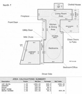
Assessors Floor Plan

Assessor’s floor plan, with modifications

The house, built in 1951, is brick with a the modern flat roof. There are skylights in the roof over the kitchen area. The living room/dining room/kitchen is one large area. One living room wall is brick with a raised fireplace and brick hearth. Large floor to ceiling windows and also glass doors to the exterior lighted the space. One glass door leads to a greenhouse. Four bedrooms and two bathrooms are in the wing that is closest to the street. One bathroom has a square deep tub in it. The house is on a concrete slab, no basement, and the furnace room is at the back end of the house. There is a carport connected to the house on the west side.

The family name Neel was still on the mailbox and the Ann Arbor City Directories confirmed that the owners were Dr. James V. Neel, geneticist at the University of Michigan, his wife Priscilla, and their children Frances, James Van Gundia, and Alexander Baxter. Priscilla did not have a separate listing as a professional architect in the directories.

The architect of this house, Priscilla Baxter Neel, had a twin. Her family lived in Wollaston, Massachusetts. Priscilla and her twin sister, Frances, both studied at Radcliffe College (the separate college Harvard University had for women) and graduated in 1940. They also received Bachelor of Architecture degrees from the Cambridge Graduate School of Smith College (another women’s college). In 1942 they were both awarded scholarships to study with Walter Gropius at the Harvard Graduate School of Design.

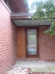
Front door, opening to the west

Front door, opening to the west

James V. Neel was born in Ohio and educated at Wooster College and then the University of Rochester, where he received a Ph.D. and an M.D.. Neel taught at Dartmouth until 1941, was in Washington in 1942 and then in the US Medical Corps. Immediately after the war (1947) he was chosen by the National Research Council to be the acting director of the Atomic Bomb Casualty Commission in Japan. The Neels came to Ann Arbor and the University of Michigan in 1948, where James was Professor of Internal Medicine and a geneticist in the Institute of Human Biology which he helped found. He was director of the University Hospital from 1966 through 1970. He was a member of many professional Genetics and Internal Medicine societies, Phi Beta Kappa, the scientific research society Sigma XI, and the medical honor society Alpha Omega Alpha. His hobby was orchid cultivation, thus the greenhouse attached to 2235 Belmont. He died at 84 in the year 2000.

Priscilla was a good friend of Mary Palmer of the Frank Lloyd Wright designed Palmer House, and with her started a yoga program in Ann Arbor. The two women and other friends were in a yoga class at the Y. Their instructor encouraged them to read some of the yoga literature, including B. K. S. Iyengar’s Light on Yoga, leading to the two of them becoming the Y’s yoga teachers. Priscilla and Mary and other women practiced yoga in Mary Palmer’s Japanese tea house in her garden. This led to Mary Palmer going to India to meet B. K. S. Iyengar and to his coming to Ann Arbor to teach yoga here.

Priscilla never practiced architecture professionally as far as we could find out. When she died in 2012 her children sold the house to Stegeman’s Campus Realty firm the next year. We believe she designed only her own house at 2235 Belmont. Her twin sister Frances designed one house in Connecticut and some time after her marriage moved here to Ann Arbor and designed and built her own house in Barton Hills where she still lives.

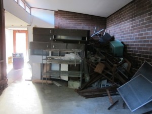
Front door, living area, fireplace at base of brick will, hidden

Front door, from living area, fireplace, hidden, at base of brick wall left edge

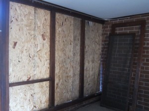
The Campus Realty firm bought the house in 2013 and by the looks of it never had a tenant move in. The mailbox still says Neel. All the windows have been taken away and replaced with plywood boards. The greenhouse attached to the living room has lost all the glass, leaving only the three foot high brick foundation, a little fan, and two thermostats on the house’s exterior wall. The shrubbery around the house is quite overgrown.

All the kitchen appliances were gone. The interior finished walls of the kitchen (and perhaps laundry room) were gone too. The milk box was intact and opened both inside and outside. The living room had a ceiling-high pile of cupboards and such in front of the raised hearth fireplace. All the copper pipe that could be reached had been removed with the holes in the walls as evidence. One of the bathrooms had the entire wall of ceramic tile taken off and left leaning against a wall in the bedroom in two large sections. We could see from the inside that the windows were removed, frames and all, not just the glass panes. All the debris from the interior demolition is still in the house.

Windows and doorway to patio, across from kitchen/dining area

Windows and doorway to patio, across from kitchen/dining area

We wish for a more positive end to this house but CR Investments has had a demolition permit since January 2015. It is not advertised for sale. CR Investments originally bought the property, which was in poor condition, to demolish and to build another small house for a family member. But that moment passed and now they are just holding the property. It is only a matter of time before architect Priscilla Baxter Neel’s only house and long-time home is replaced by another dwelling.

But we finally found an early photograph of the Neel house; the Ann Arbor News did a feature article on the house and architect Priscilla Neel and it appeared in the paper in May of 1952. You can see the original Ann Arbor News article and see pictures here and here.  In the exterior photograph, taken in 1952,  Dr. Neel’s orchid greenhouse is yet to be added outside the glass door on the right side of the photograph.


Milk Chute, by the Utility Door

Milk box by the utility door

Inside the kitchen

Inside the kitchen


By Frances Wright, March 11, 2016

Wells Ira Bennett, Educator and Architect

Wells I. Bennett led the College of Architecture and the University of Michigan as Dean from 1938 to 1957. Arriving at the university in 1912 as Instructor, Bennett rose to leadership through his early interest in low-cost housing and city planning. As a practicing architect in Ann Arbor, Bennett was active after 1921, developing a considerable residential practice mainly with faculty clients.

Taking a sabbatical leave in 1932-33 to study schools of architecture and post-WWI housing projects in Europe, Bennett published two articles on housing projects in the US and France in 1935. In addition he offered a course analyzing practices in low-cost housing projects with various forms of government intervention in England, Germany, Austria, Holland and France.

At this time in the Depression the US government authorized over three billion dollars for low-cost housing and slum clearance but with the proviso that each specific project be presented as part of a larger plan. At the time there were few trained town and city planners, opening a field for city planning that MIT stepped up to meet in 1934. At this same time Bennett, working with then Dean Emil Lorch, developed courses in this area, including housing, that gave Michigan’s program a unique place in the Middle and Far West. A formal degree in City Planning entered the architecture school’s curriculum in 1946.

A key initiative by Bennett starting in 1940 was a Forum gathering of architecture school administrators and architects at the university for the purpose of sharing insights and defining common interests. The first gathering brought together a who’s who of practictioners, including Eliel Saarinen and Eero Saarinen at Cranbrook, and Joseph Hudnut, Dean of the Harvard School of Design and a 1912 alum of the UM architecture school. The collegial dynamic inspired by these yearly meetings proved invaluable to the university in 1948 when venerable Professor Jean Hebrard retired and high enrolment created a need for recommendations for new staff and teaching leadership in architecture. These recommendations, for example, led to bringing in William Muschenheim in 1950.

Bennett served on the Ann Arbor City Planning Commission since 1935 and on the State Board of Registration for Architects, Engineers and Surveyors since 1939. He was a Fellow of the American Institute of Architects and was President of the Detroit Chapter from 1946 to 1947. During his tenure as Dean he brought a series of fine teachers to his program, including Mary Chase Stratton (1937), Gerome Kamrowski (1946), Herbert Johe (1947), Edward Olenki (1948) and William Muschenheim (1950).

By Jeffrey Welch, March 11, 2016

"A star architect's vision Yamasaki's Chelsea High School"

Author: Grace Shackman

What was a star architect thinking?

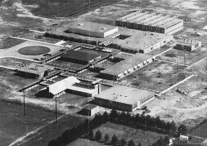
When I worked at the Chelsea Standard in the 1980s, I often covered events at Chelsea High School. It was not a single building, but a campus of one-story structures that students scurried between in all types of weather. I was told it was designed by a California architect who didn’t understand Michigan winters.

Imagine my surprise to learn, years later, that it was actually the work of Minoru Yamasaki, the famous Modern architect who went on to design the World Trade Center. Born in Seattle, Yamasaki moved to Detroit in 1945, so by the time he designed the school in 1956, he had been through eleven Michigan winters.

But Yamasaki evidently wasn’t thinking about winter. In a 1957 interview with Architectural Forum, he explained: “We hit upon the idea that if the buildings could each express their individual character that we might be able to depict the quality of a small town. The auditroium, gym, homemaking area would symbolically and literally be the town center.”

Chelsea High School

Chelsea High School

Yamasaki was hardly the first architect to ignore practical problems. A janitor once broke a leg tending an elevated planter at Alden Dow’s Ann ARbor library. Frank Lloyd Wright’s eccentricities – leaking roofs, tiny kitchens – are well know. But Chelsea needed a new school – the high school population, then fewer than 400 students, was predicted to double in ten years.

Local architect Art Lindauer encouraged an innovative design. “I went to the school board and said, ‘Every school looks like each other,'” recalls Lindauer, the father of Chelsea mayor Jason Lindauer. “‘Why don’t you try an architect with a different approach?'” Asked for suggestions, he mentioned Yamasaki, who at the time was activiely pursuing school work. After interviewing a dozen architects, a citizen’s committee recommended hiring Yamaski, Leinweber, and Associates.

Peter Flintoff, whose father, Howard Flintoff, was secretary of the school board, recalls hearing that they felt lucky to get Yamasaki. Alyce Riemenschneider remembers that her parents and their friends were also excited to have someone so famous design their school.

Chelsea High School

Chelsea High School

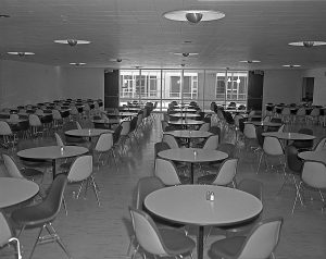
People raised questions about the campus layout, but according to the Standard, school board members argued that the design would “provide the best building program at the most economical cost.” Outside walkways would to-ceiling windows [it] was much nicer than the traditional string of hallway lockers,” recalls Carol Cameron Lauhon, who also graduated in 1961. Covered walkways with brightly colored bubbles at building entrances served to unify the campus and afford some shelter as students passed between classes.

The main building, which Yamasaki called the “Town Center,” contained the cafeteria, library, gym, and auditorium. Circling the auditorium were six classrooms used for English and social sciences. A Central atrium was open to the sky and filled with planst and bushes. “For the prom, the junior class would decorate the atrium with flowers and green plastic truf and furnish it with a wooden bridge over a small pond. Couples posed on the bridge for their prom photos. Very romantic!” recalls Lauhon.

June Winans, who taught earth science and geology, shared the science building with biology, chemistry, and physics teachers. Shop classes, the Standard explained, also had their own building so that “noises made by operating equipment or hammering and sawing will not disturb other classes.”

Chelsea High School

Chelsea High School

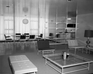
The home economics and art building had a pitched roof to look more like a house. Riemenschneider recalls that the desks converted into cutting tables and that sewing machines were hidden in veneer cabinets. The kitchen had the newest stoves and refrigerators and an island, a novelty at the time. After preparing a meal, the students moved into a dining room and a living room.

At an open house, the Standard reported, “most people were impressed not only with the beautiful appearance of the new campus type high school but also with its very evident functional features.”

The students who made the transition still have fond memories of Yamaski’s school. “The exterior walkways between buildings felt less confining than the old school’s intererior hallways and multiple stairwells, some of them narrow and windowless,” says Lauhon.

“I was happy to walk outside,” says Brown, adding: “The teachers aid it woke the students up.”

“The breath of fresh air did them good,” says Bill Chandler, the school’s work-study coordinator. Sam Vogel, social studies teacher and later assistant principal, recalls that “the covered walkways developed leaks, but, unless it was pouring, it wasn’t a problem.”

Parents were less thrilled. Some thought it was ridiculous that their children had to go outside. One recalls her daughter tell her, “mom, we don’t need decent clothes to go to school. We just need a good coat.”

As enrollment grew, an auto mechanics garage was added, and a new bulding facing Washington for social studies. The cafeteria was enlarged by moving the library into another building.

But when the locker room got overcrowded and rowdy-the staff dubbed it “God’s Little Acre” – there was no way to expand it. Eventually the lockers were movied into the “town center,” but “then the halls were too crowded,” Vogel recalls. The atrium also became a problem, with maintenance issues and heat loss through the single-pane glass the surrounded it.

Yamasaki’s futuristic vision never caught on: the present Chelsea High, built in 1998, is again a single building. His campus, however, is still in use – its buildings now house the Chelsea Senior Center, school board offices, Chelsea Community Education and Recreation, and Chelsea Early Education. The roofs and bubble entrances are gone, the original large windows have been replaced by smaller ones, and the atrium has been filled in to create a windowless meeting room.

But students who went there still have fond memories of their school. “It seems to me that the Yamasaki design was a new way of imagining spaces for student life,” says Lauhon. “The school was a pleasant place to be. My sense is that this is what Yamasaki had in mind.”

Copyright
Copyright Protected
Rights Held By
Grace Shackman

Modern in Context

This article provides additional context for what was happening in design, education and practice during the “modern” period. All which influenced architecture and design in Ann Arbor. Another excellent resource for research and practice specific to the University of Michigan is More than a handsome box : education in architecture at the University of Michigan, 1876-1986 by Nancy R. Bartlett, Ann Arbor, Mich. : University of Michigan College of Architecture and Urban Planning, 1995.

 
Bauhaus:  A school of fine and applied arts founded by Walter Gropius in 1919 in Weimar, Germany.  It moved to Dessau and was later run by Ludwig Mies van der Rohe.  The school attracted many designers such as Wassily Kandinsky, Marcel Breuer, and László Moholy-Nagy.  Many designers from the school emigrated after the Nazi Party came to power in 1933, including Gropius who taught at Harvard and Mies who taught at the Illinois Institute of Technology.
 
Cranbook Academy:  A post-graduate school of fine and applied arts founded in 1926 at Bloomfield Hills, Michigan by publishing magnate George Booth.  He hired Finnish architect Eliel Saarinen, who was teaching at the University of Michigan, to design and later administer the school.  Like the Bauhaus School, it produced and attracted many designers such as Ray and Charles Eames, Florence Knoll, Ralph Rapson, Carl Milles, Edmund Bacon, and Eero Saarinen. 
 
Gropius, Walter: (1883-1969)  German-American architect and founder of the Bauhaus School, he is considered one of the three pioneering masters (Mies and Le Corbusier are the others) of the International Style. He immigrated to the United States in the 1930s and taught at Harvard University.  His private practice was known as The Architects’ Collaborative (TAC).
 
International Exhibition of Modern Architecture:  Held in 1932 at the Museum of Modern Art in New York, it formally introduced the International Style to the United States.  The show was curated by Philip Johnson and Henry-Russell Hitchcock. 
 
International (Modern) Style:  defined by its use of material rather than form, it lacked traditional and historical adornment.  It tended to use new or traditional materials in new ways such as glass curtain walls, pre-stressed concrete, aluminum window frames, and porcelain enamel spandrel panels. 
 
Le Corbusier:  (1887-1965)  Chosen name of Swiss-French architect and designer Charles-Édouard Jeanneret, who promoted the International Style.  Among his published works are Towards A New Architecture and Radiant City, a concept of towering apartment blocks on park-like settings which later influenced many urban projects in post-war America. 
 
Mies van der Rohe, Ludwig:  (1886-1969)  German-American architect and last director of the Bauhaus School.  He emigrated to the United States in 1937 and became head of the architecture school at the new Illinois Institute of Technology, where he also designed the buildings and master plan.  One of his landmark commissions was the Seagram Building in New York, which he co-designed with Philip Johnson. 
 
 
Wright, Frank Lloyd:  (1867-1959)  American architect and designer best known for developing the Prairie Style and the Usonian house, he sought an organic and geometric vocabulary.  He also applied modern concepts and technologies such as open floor plans and reinforced concrete.  According to James Marston Fitch’s American Building:  The Historical Forces That Shaped It, Wright bridged the gap between the Chicago School and the coming of the International Style.  His long career covered a range of building types from residences and churches, to civic and office buildings.  Wright’s major works include the Larkin Building, Falling Water, Unity Temple, and Robie House. 

by Anthony Timek, architectural historian, April 2011

What is modern: characteristics of modern architecture

What is different about modern architecture? a2 modern member, Greg Jones, A.I.A., summarizes some of the common characteristics of this period of architecture.

Characteristics of Mid-Century Modern:

  • Lack of ornament: Decorative moldings and elaborate trim are eliminated or greatly simplified, giving way to a clean aesthetic where materials meet in simple, well-executed joints.
  • Emphasis of rectangular forms and horizontal and vertical lines: Shapes of houses are based boxes, or linked boxes. Materials are often used in well-defined planes and vertical forms juxtaposed against horizontal elements for dramatic effect.
  • Low, horizontal massing, flat roofs, emphasis on horizontal planes and broad roof overhangs: Modern homes tend to be on generous sites, and thus many, but not all, have to have meandering one-story plans. Many examples hug the ground and appear of the site, not in contrast to it.
  • Use of modern materials and systems: Steel columns are used in exposed applications, concrete block is used as a finished material, concrete floors are stained and exposed, long-span steel trusses permit open column-free spaces, and radiant heating systems enhance human comfort.
  • Use of traditional materials in new ways: Materials such as wood, brick and stone are used in simplified ways reflecting a modern aesthetic. Traditional clapboard siding are replaced with simple vertical board cladding used in large, smooth planes. Brick and stonework are simple, unornamented, and used in rectilinear masses and planes.
  • Emphasis on honesty of materials: Wood is often stained rather than painted to express its natural character. In many cases exterior wood is also stained so that the texture and character of the wood can be expressed.
  • Relationship between interior spaces and sites: Use of large expanses of glass in effect brings the building’s site into the building, taking advantage of dramatic views and natural landscaping.

  • Emphasis on open, flowing interior spaces: Living spaces are no longer defined by walls, doors and hallways. Living, dining and kitchen spaces tend to flow together as part of one contiguous interior space, reflecting a more casual and relaxed way of life.
  • Generous use of glass and natural light: Windows are no longer portholes to the outside, but large expanses of floor to ceiling glass providing dramatic views and introducing natural light deep into the interior of homes.
  • Use of sun and shading to enhance human comfort: The best modern homes are efficient. They are oriented to take advantage of nature’s forces to provide passive solar heating in the winter, while long overhangs and recessed openings provide shading to keep homes cool in the summer.

Alden Dow’s Ann Arbor by Grace Shackman


Originally published in:  Ann Arbor Observer, August 1998

Inspired by a teenage trip to Japan, the Dow Chemical heir spurned the family business to devote his life to architecture. From city hall to the U-M’s administration building, he put a quirky modernist stamp on the city.

Judy Dow Rumelhart was walking down Fifth Avenue one day recently when it started to rain. Looking around for shelter, she spotted the Ann Arbor District Library, a building originally designed by her uncle, Alden Dow. “And I thought how lovely it is,” Rumelhart says. “The library is one of my favorites.”

“The library and city hall are two of the ugliest buildings in Ann Arbor, and ISR [the U-M Institute for Social Research] is right up there,” says library board member Ed Surovell, expressing a dissenting opinion on the library and two other Dow designs. “They do not have the kind of imposing presence of a public building that creates civic pride.”

Alden Dow (1904–1983) is an unlikely figure to provoke such controversy. Though Frank Lloyd Wright once called him his “spiritual son,” Dow had none of the older architect’s egotism or self-promotion. Shy and studious, Dow had to be encouraged to take on major public commissions by his devoted wife, Vada. He got much of his work through family connections; his father, Herbert, was the founder of Dow Chemical.

Alden Dow’s entree to Ann Arbor was through his sister Margaret and her husband, U-M physician Harry Towsley. His first residential commission, in 1932, was the Towsley home in Ann Arbor Hills. Over the next thirty-six years, Dow designed seventeen more Ann Arbor buildings; in the 1960s, his work was so highly regarded that both the city of Ann Arbor and the U-M hired him to design their administrative centers: the Larcom Municipal Building (1961) and the Fleming Administration Building (1964).

Like Frank Lloyd Wright, with whom he studied, Dow sought to integrate his buildings into their environment. His motto was, “Gardens never begin, and houses never end.” Especially in his residential projects, he was capable of blending building and landscape brilliantly.

The going was tougher when the commission was a civic building downtown. He sometimes attempted to domesticate these urban settings by specifying massive upper-story planters, but in Ann Arbor, most of these have long since been abandoned as impractical.

Despite the common elements he sometimes used, Dow was no assembly-line architect. His Ann Arbor buildings have evoked comparisons as diverse as “a Mondrian painting” (the Fleming Building) and a “bureau of drawers” (city hall). But especially in recent years, those characterizations have not always been flattering.

Last year, shortly after taking office, U-M president Lee Bollinger announced that he wanted to move his office out of the Fleming Building, which he called “fortresslike.” (Its slit windows, arched entryway, and looming overhangs do give the Fleming Building a defensive look, but the popular belief that Dow designed it to shut out student protesters is unfounded—the plans were completed well before the campus demonstrations of the 1960s turned violent.)

Others have since risen to the building’s defense, including Robert Venturi and Denise Scott Brown, the celebrated “postmodern” architects whom Bollinger retained to develop a new master plan for the university. But Bollinger’s comments are a sure sign of Dow’s declining stature in the city he did so much to shape.

Alden Dow was born in Midland in 1904, the fifth of Grace and Herbert Dow’s seven children. His parents had assumed that he would go into the family business, but they also encouraged his creativity by exposing him to art, historic buildings, and gardens. When he was a teenager, the whole family took a trip to Japan. “They went in a big ship and stayed for three or four months,” relates his niece Judy Dow Rumelhart. The trip exposed Dow to two of his greatest influences as an architect: the exacting simplicity of Japanese design and the striking modernism of Frank Lloyd Wright, whose newly completed Imperial Hotel the family admired.

Dow spent three years at the U-M studying mechanical engineering, but then begged his parents to let him switch careers. He transferred to Columbia’s School of Architecture and in 1930, while still a student, his father got him his first commission: a clubhouse for the Midland Country Club. Upon graduation, Dow joined a Saginaw firm and married Vada Bennet, his childhood sweetheart, in 1931. His sister and brother-in-law, Margaret and Harry Towsley, promptly hired him to design their home.

As originally designed, the Towsley house was basically a three-bedroom ranch, although much more elegant than those that would become ubiquitous after World War II. Its features included clerestory windows, a copper roof, and raised planter boxes designed to blend house and landscape.

Dow designed the interior of his houses in minute detail and even dictated the color schemes. “He loved strong colors, primary colors, and jewel tones,” recalls Rumelhart—“cherry red, cerise, emerald green, purple amethyst, ruby topaz.”

Considering Dow’s great interest in gardens, it’s ironic that his most influential innovation at the Towsley house was the way he designed the driveway: he specified an attached garage facing the street, believed to be the first in the country. “We thought the house looked like a gas station,” recalls family friend Jack Dobson.

Asked whether it was strange to grow up in such an unusual house, Rumelhart replies, “I loved the house. . . . and had a sense of pride of being in it. I thought all architecture should look like that.”

During construction, Dow fought repeatedly with city building inspectors, who he saw as trampling on his artistic license. For instance, he wanted to give the house unusually low ceilings, 7’6″ instead of the required 8′. Denied, he recorded his losing battles in a series of four bas-reliefs in the front hall; one shows an architect being stomped by an authoritarian foot while another depicts him strangled in red tape.

Although the house had been planned as a starter home, the Towsleys lived there all of their lives. They just kept asking Dow to design additions, which he did in 1934, 1938, and again in 1960. Dow put his latest ideas into each revision such as a landscaped backyard viewed through a big dining room window and so many built-ins that there was little need for furniture: he provided a built-in safe, walk-in refrigerator, clothes drawers that opened on both the bedroom and dressing room sides, and even metal drawers especially designed to store Margaret Towsley’s extensive collection of linen tablecloths. The original color scheme was vividly patriotic in the main living areas: cherry-red rug and turquoise walls.

In 1933, Alden and Vada Dow spent six months at Taliesin, Frank Lloyd Wright’s studio-home complex in western Wisconsin. While Alden studied architecture, Vada completed her own fellowship in painting, weaving, and pottery.

Dow and Wright maintained a friendship for years after the Dows’ time at Taliesin. The two architects visited each other in their homes and Dow even named one of his daughters “Lloyd.” They had a serious falling out, however, in 1949, when Wright lost a commission to design the Phoenix Civic Center because his fee was too high–and Dow agreed to take the job in his place. According to Craig McDonald, director of the Alden Dow Home and Studio in Midland, it was Vada Dow and Olgivanna Wright who finally persuaded their husbands to make peace.

After Taliesin, Dow set up his own firm in Midland. Despite the Depression, Dow Chemical was booming, and he designed homes for an ever-increasing circle of clients. As his reputation grew, he received commissions from as far away as North Carolina (a residence for the president of Duke University) and Texas (an entire company town, Lake Jackson, for Dow Chemical during World War II). But Midland always remained his base: of the 138 buildings he designed in his career, 104 are in his hometown.

Ann Arbor is second only to Midland, with eighteen Dow buildings. Surprisingly, very few are private homes; he built only two more residences here, both for doctors who knew Harry Towsley: the Sibley Hoobler house (228 Belmont Road) in 1949, and the Joe Morris house (7 Regent Drive) in 1962. Hoobler has since died, but Joe and Julia Morris still live in their Dow house and vividly remember the design process.

In the early 1960s, Joe Morris asked Harry Towsley whether he thought Dow would design him a house. Towsley suggested that he write and ask, and Dow responded by inviting Morris to Midland for lunch. During lunch, Morris recalls, the architect “talked about sailboats, about housing–he had an idea about housing for Third World countries by making plastic modular units and dropping them in by helicopter. When we returned, I told his secretary we hadn’t talked about my house. She said, ‘Wonderful. He needs to get his mind off his work.’ ”

The Morrises waited two years before Dow had time to work on their house. When they finally sat down to review the plans, they found that Dow had definite ideas about what he wanted. For instance, Joe recalls, Dow’s original plan did not include room to eat in the kitchen–“He said we would never eat in the kitchen.”

“We insisted we would,” Morris continues. “So he relented and designed a [built-in] kitchen table.” The furniture that Dow didn’t build in, he selected, including daybeds, dining room table and chairs, and the chairs and sofa in the living room. All of the built-ins and carefully coordinated furniture result in a very clean look. Morris calls it “magnificent simplicity.”

Joe Morris was one of many clients invited to visit Dow’s combined home and studio in Midland. A beautiful and unusual building, it was a good advertisement for his artistry.

Like the Towsley house, Dow’s evolved in a series of additions. It began in 1933 as a long train car–like studio. In 1935, he added its most striking feature, a room half-submerged in a pond. Officially called the “floating conference room,” but known informally as the “submarine room,” its ingenious use of water invites comparisons to Wright’s more famous Falling Water.

In Midland, Dow was able to build the low ceilings he was denied in Ann Arbor. “I got a kick out of his studio,” recalls Fred Mayer, U-M’s director of university planning. “He was about 5’6″, so the studio was designed for him. I’m 5’8″, so it was okay with me.”

The low ceilings and small proportions in Dow’s house reminded Morris of “Beatrice Potter homes in Peter Rabbit. There was the same childhood comfort in his home.” Bill Reish, who visited Midland in the seventies to discuss an addition to Greenhills School, recalls the “sunken room at duck-eye level, with ducks floating by.” Former library director Gene Wilson missed that view–“The pond was leaking the day I was there, so he had it drained.”

People remember Dow’s appearance as slightly eccentric. “He was wearing different-colored shoes, I think yellow,” Wilson recalls. Adds Rumelhart, “He wore his hair longer than the conventional doctors I was used to.”

Craig McDonald, who was Vada’s assistant in the last years of her life, recalls Alden as “quiet and understated. He was somewhat shy, but expressed himself through design.” The late Guy Larcom, who oversaw construction of Ann Arbor’s city hall, remembered him as “a small man, undistinguished–but impressive when he talked about architecture.”

“He could be very intense if he got excited about something,” Rumelhart says. “He could pick a flower and be overwhelmed. He had a creative intensity.

“I loved Alden,” Rumelhart continues. “He said it was okay to be a singer. The medical world was terrified of the arts, but he told my parents, ‘She’s talented. She should be doing what she is doing.’ ”

Dow’s peak period in Ann Arbor came during the 1950s and 1960s when he built six university and three civic buildings. The U-M’s Margaret Bell Pool (1952) was his first college commission; it opened doors, and he eventually worked on nine other campuses in Michigan.

Before it was built, the U-M had two pools reserved primarily for men, while women had only the “Barbour bathtub” in the basement of Barbour gym. Margaret Bell, head of women’s physical education, had long wanted to redress this injustice. According to Sheryl Szady, who has researched the history of U-M women’s athletics, “She said, ‘Before I leave, I’m getting a pool.’ ” Bell organized bridge parties, sold tiles, and organized benefit parties to raise the necessary funds. Margaret Towsley, a friend of P.E. professor Marie Hartwig and a generous patron of progressive causes, probably contributed to the project.

The new pool was state of the art. Designed for synchronized swimming and for Michifish shows (elaborate performances with costumes, lighting, and staging), it had an air flow system that sent cool air over the spectators in the bleachers and warm air over the pool. Underwater speakers allowed the synchronized swimmers to hear the music.

According to Szady, the day before the pool opened, Bell, Hartwig, and another woman “hopped in and played around.” At first, men were allowed to swim at the pool only on Friday nights. The pool became coed in 1976 when the building was enlarged to become the Central Campus Recreational Building. Last year the kinesiology department put on another addition, but Dow’s original building is still discernible, especially the second-story planters, the only ones in Ann Arbor that are still maintained.

In 1964, Dow designing two large buildings just a half a block apart on Thompson Street: ISR, the first new building in the country dedicated solely to social research, and the administration building, later named in honor of Robben Fleming, the university’s tenth president.

The two buildings have striking exteriors, but both have been criticized as being designed from the outside in, sacrificing interior utility to achieve an exterior effect. For instance, as originally designed, the massive white aggregate panels that face ISR would have left the offices behind them with no exterior windows. According to retired psychology professor Bob Kahn, one of ISR’s founders, Dow had to be persuaded to move the panels out slightly so that small slit windows could be added.

Dow planned ISR’s interior in detail. The space was divided into modules, each with a large open area facing a window wall, with two offices on either side of the open area and two slightly bigger offices in the corners. “The offices would be almost all one of two sizes to minimize status,” recalls Kahn. Dow was proud of the egalitarian effect, noting in his 1970 book, Reflections, “All occupants have a similar relationship, through glassed area, with the outside.”

But research projects did not always divide neatly into the modules Dow prescribed. And despite his egalitarian goals in designing the faculty offices, the ISR layout also perpetuated what, in hindsight, looks like a far greater inequity: while the researchers had private offices, the female support staff was assigned to desks that sat in the middle of the central area, without a shred of private space. Room dividers were eventually added–but these in turn blocked out light to the side offices.

Maintenance on the windows also presented a problem. They were locked with special keys and pivoted open to wash. People would open the windows to let in air, then not secure them because they didn’t have the key. Once, “a person on the fifth floor was leaning against the window when it pivoted,” recalls retired ISR administrator Jim Wessell. “He almost fell out. Luckily he was caught by someone nearby.”

The windows on the Fleming Administration Building opened the same way but were arranged very differently: in geometric patterns reminiscent of a Mondrian painting. While intriguing from the outside, the design created some very curious interior spaces, with long, thin windows in unpredictable locations.
Dow’s most unusual campus building, the Fleming Building, is also the most controversial. Ed Surovell calls it “a cube in space” and says of the entrance, “you have to hunt for it like a medieval castle.” People who work in the building complain of the “mazelike” layout.

The Regents’ Room on the first floor is designed with an arched ceiling, which, according to Craig McDonald, was used “to give a feeling of being in a larger space.” Two similar arches take up the rest of the first floor: the middle arch is a corridor connecting the east and west entrances, and the other serves as offices. The cavernous look has caused people to compare the space to a beer vault or a wine cellar, and audiences at regents’ meetings often decry the absence of windows and call it “the cave.”

Rumelhart defends the design, saying, “Alden took the assignment and created a painting. He was a great fan of Mondrian and he fulfilled that feeling.” Also siding with Rumelhart is architect Denise Scott Brown. Asked about the Fleming Building, she calls it “honorable architecture” and says it is “nicely proportioned.” “Taste cycles,” adds Brown’s husband, Robert Venturi. “There was a time when Victorian architecture was thought ugly and torn down. We have to be tolerant of the immediate past.”

Changing taste is one problem with the building, but of the more utilitarian problems, many are not Dow’s fault but are the result of growth. “It was never intended to have as many people as it does now. When there was a big lobby on every floor, it was more aesthetically pleasing,” says Dick Kennedy, retired vice-president for government relations.

“You’d get off the elevator and see a bank of windows onto the plaza,” recalls Kay Beattie, who worked in the building in its early days. “You had the feeling no one worked there.” Beattie also remembers that, in vintage Dow fashion, each floor had its own vivid color theme–longtime employees describe them with names like “Howard Johnson orange” and “football field green.”

As controversial as the Fleming Building is, it could have been even more eye-popping. According to Fred Mayer, university architect Howard Hacken vetoed Dow’s original plans to finish the exterior in white stucco with blue windows and gold trim. “Very rah-rah,” Mayer laughs.

Dow left a strong mark on the U-M campus, but it was nothing compared to his impact across Division Street. In the library and city hall, he defined the two most important buildings in Ann Arbor’s public life.

The library was built first, in 1956. “After the war there was no established library architecture,” recalls Gene Wilson, then a library staff member, later director. “Dow had built the Midland library, and we thought it was grand.”
His Ann Arbor design had all of the Dow hallmarks. Even today, after two additions, one can still recognize his hand in the elevated planter faced with turquoise enamel paneling and the lovely little garden on the south side.

“I always liked it,” Wilson says of the library. “It was state of the art for its time.” But, he admits, there were problems. “Dow was more concerned with visual impact–he wanted it to be noticed, he didn’t let function get in the way. There was a circulation desk but no reference desk, and there was no clear delineation between public and private areas. We had to scramble around to make [the layout] work.”

Like many other clients, the library also found that Dow’s elevated gardens were difficult to maintain. Wilson doesn’t recall exactly when the library stopped tending the second-story planters, but says, “it would have been very early. There never was a way to get to them except by a long ladder put up by the sidewalk–any maintenance was done by the janitor climbing the ladder. One day the ladder slipped and the janitor fell and broke his leg. After that we lost enthusiasm.”

Dow’s other great downtown project, the Ann Arbor city hall, has been a conversation piece ever since it opened in 1961; in addition to a chest of drawers, it’s been compared to “an inverted wedding cake” and “an upside-down carport.” It’s also been called “a poor man’s Guggenheim,” an allusion to Frank Lloyd Wright’s famous upward-spiraling museum in New York City.

The building is an inverted stepped pyramid, with the floors growing wider as they go up. The second floor is a large promenade that Dow thought might be used for public meetings or for city council members to step outside to caucus. (Rumelhart has always thought it would be a good place to perform plays.)

Inside, Dow put elevators, stairs, conference rooms, and department head’s offices near the building’s core. The space around the periphery of the building was kept open. “The idea was that there were to be no prestige offices, no best windows,” recalled Guy Larcom in an interview before his death last winter. “It was all open to public view.”

Kathy Frisinger, then the city’s assistant director of central services, oversaw the move into the new building. She remembers that although employees were glad to be together after being scattered at seven different locations, many didn’t like the open floor plan. “You could see from one end to the other,” she explains. “If you talked to someone, everyone could see you talking, see which office you went into.”

The promenade never got much use, and there were serious problems with roof leaks. Switchboard operator Mary Schlecht recalls that when it rained, the police department downstairs had buckets all over the place. The planters Dow specified on the second and third floors also leaked. “The plants grew well on the north side, but it got too hot on the south and you had to water almost every day,” a former employee recalls. City hall’s maintenance people, like their counterparts at the library, eventually gave up on the planters; they’re now filled with rocks.

Dow ordered the building’s furnishings with his characteristic eye for vivid color. “I’ll never forget that day when seven Steelcase trucks came. Big semi trucks drove up with turquoise and orange furniture,” laughs Frisinger, who supervised the unloading. “I saw mine were to be orange and I said, ‘I don’t think so,’ and did a quick switch.” Nonetheless, she says, “I basically enjoyed the building. I liked the big offices, the open spacious feel in the building. Dow was ahead of his time.”

As city hall has become more crowded, its once open spaces have given way to a warren of cubbyholes. Furniture and curtains have been placed in front of most of the big windows in the inner offices to give more privacy. The top floor, recently remodeled after the district court moved to the county courthouse, today comes the closest to the spacious feeling Dow originally intended.

Dow worked up to his death in 1983, but the debate continues on his rightful place in architectural history. The question of whether or not his buildings look good comes down to personal taste, and there can be no global or permanent answer. Setting that aside, a study of his Ann Arbor work shows that while many have serious practical problems, there were always reasons for what Dow did.

Near the top of the list of problems would have to be his flat roofs, a distinction he shared with his mentor, Frank Lloyd Wright. “Talk with any person about an Alden Dow building and they will sing its praises and then remember the trouble they had with the roof,” says Greenhills’ Bill Reish. Dow’s elevated planters were another recurring source of trouble. The only one still in use in Ann Arbor, at the U-M’s kinesiology building, supports a few scraggly plants. Ann Arbor has apparently tended its Dow buildings less carefully than his hometown. Craig McDonald reports that numerous examples of Dow’s elevated plantings are still flourishing in Midland.

Lighting could be listed among Dow’s greatest failures but also among his greatest successes. It was obviously a lifelong obsession and when it worked, it worked gloriously, as in the big windows that both let in light and created splendid views in his private homes. When his plans went astray, however, people worked in dark caverns such as those in the Fleming Building and ISR.

It could be argued that these failures were not so much design errors as a misreading of human nature, especially the need for privacy. “Human nature will confound you if you fight it too much, even with a good idea,” comments Fred Mayer.

Dow seems to have been the most successful in his smaller projects, particularly the private residences where he could think out the use of every inch of space. In the larger buildings, he was most successful in the ones built for a specific use, particularly those associated with family members such as Greenhills or the medical education building.

Some of Dow’s critics complain that he received the Ann Arbor jobs only because of his connections with the Towsley family. Certainly some of his work came directly through his sister and her husband, or as a result of friendships or community contacts made through them. Fred Mayer defends Dow on this score. “Having connections will give you a chance,” he says, “but if you don’t do something good, it won’t save you.”

Most of the serious criticism of Dow is aimed at his multistory buildings. Architects don’t like to speak ill of other architects, even dead ones, but off the record, several express doubts about Dow’s “bulky, boring” multistory designs.

“Nothing is related to human scale in ISR. It’s just a big white space,” says one architect–who goes on to describe the Fleming building as “weird.” But Mayer again comes to Dow’s defense. “He was a talented architect,” he says. “I don’t know if he will make it in the ranks of the great, but talent and creativity are evident in his best buildings.”

Dan Jacobs, who’s designed several additions to Greenhills, agrees. “I’m a great admirer of Dow. I admire the simplicity of his structural system.”

Despite the complaints, it should be noted that all of his Ann Arbor designs, except for one razed gas station, are still being used for their original purpose. Even the Fleming building, threatened during Bollinger’s term with a changed use, is still the administration building. Asked about Bollinger’s dislike of her uncle’s building, Judy Dow Rumelhart lets out a good-humored laugh–but then admits that she has chided Bollinger for his criticism of the building. “He can move out, but I hope he uses it for something else, maybe English classes,” she says. “Let it be used by someone to enjoy.”

An Alden Dow Chronology:
Between 1932 and 1970, Dow designed eighteen Ann Arbor buildings. Details are given only for buildings not described in the main story.
1932: Towsley home, 1000 Berkshire.
1949: Hoobler home, 228 Belmont.
1952: Margaret Bell Pool (U-M).
1956: Ann Arbor District Library, 343 S. Fifth Ave.
1958: Ann Arbor Community Center, 625 N. Main. Dow designed the building at the request of his sister, Margaret Towsley. Towsley not only contributed most of the cost, she also paid for many of the buildings furnishings–even dishes and towels.
1959–1965: Matthaei Botanical Gardens, (U-M). The gardens’ offices and conservatory are instantly recognizable as Dow’s work thanks to the turquoise-faced second-story planters (long since abandoned). Herb Wagner, professor emeritus of botany, remembers fighting to include a lobby and meeting room in the plans; more than thirty years later, Wagner says, it remains “one of the best university botanical gardens in the nation.” Dow also designed the garden superintendent’s house.
1960: Leonard gas station, 2020 W. Stadium. Possibly conceived as a prototype for Michigan-based Leonard, this simple, well-landscaped gas station was Dow’s first commercial work in Ann Arbor. It is the only Ann Arbor Dow building no longer standing.
1961: Guy J. Larcom Jr. Municipal Building, 100 N. Fifth Ave.
1962: Morris home, 7 Regent.
1962: Conductron headquarters, 3475 Plymouth. Keeve “Kip” Seigel, founder of the high-flying Conduction conglomerate, was a friend of the Towsleys. The low-slung brick building is currently the headquarters of NSF International.
1963: University Microfilms, 300 N. Zeeb. Dow met University Microfilms founder Gene Power, a U-M regent, through the Towsleys. To recycle water used in processing microfilm, he included a moat on the south side of the building, creating what he called “a reflecting pool for office and cafeteria.”
1964: Institute for Social Research (U-M).
1964: Fleming Administration Building (U-M).
1964: Michigan District Headquarters, Lutheran Church Missouri Synod, 3773 Geddes. Dow built some lovely churches in Midland, but this is his only church-related structure in Ann Arbor. Its four wings are grouped in the shape of a Greek cross; the teepee-like dome on top symbolizes the church’s early Indian missions.
1966: Towsley Center for Continuing Medical Education (U-M). Dow’s last major job for the university was arguably his most successful. One of Harry Towsley’s specialties was continuing education, and the brothers-in-law collaborated closely on a simple, straightforward building marked with Dow trademarks such as long corridors filled with windows and plants. “It’s state of the art, designed for traffic flow, with an auditorium and four break-out rooms, a huge lobby,” facilities coordinator Robert Witte says. “If I was ever asked to design a medical education building, I would design it off the Towsley Center.”
1967: Greenhills School, 850 Greenhills. Judy Dow Rumelhart was a member of the original planning committee for this private north-side school, and Margaret Towsley was on the first board. Dow laid out the building as a series of clusters, each with classrooms around the edge and a court in the middle. In the middle of each court is a common space called a “forum”; in the corners are areas for quiet activity, called “alcoves.”
Starting in 1968 with grades 9–12, Greenhills gradually expanded to accommodate grades 6–12. By opening alcoves and linking them to new clusters, Dow designed additions that felt as if they were part of the original. Over the years, the brown walls and curiously colored carpets Dow specified have been toned down, and doors have been added to control noise. Still, Bill Reish says, “It works wonderfully as a school.”
1970: 2929 Plymouth. After Gene Power stepped down from University Microfilms, he commissioned Dow to build this small office building just east of Huron Parkway. “I was glad I selected Alden, because my site presented a difficult design problem,” Power recalled in his autobiography, Edition of One. “The zoning regulations stated that floor space could not exceed 40 percent of the land area. There had to be one automobile parking space available for every 110 square feet of floor space, and the structure could be no more than three stories high. Dow met these requirements by raising the building on columns, with only a small entrance lobby and elevator area extending down to the ground-floor level. Most of the area on that level formed a parking lot beneath the rest of the building.”

Power’s son, U-M regent Phil Power, recalls the office as “a lovely place to work. It had a beautiful view of North Campus. It had a fireplace, shelves with Eskimo art, orchids, a nice sitting area, and was lined with bookshelves.” The building—which always reminded Rumelhart of “a giant toadstool”—is now rented to a number of small tenants.

[Photo caption from book]: Dow was proud of his egalitarian design for the faculty offices at the ISR. But he also perpetuated what, in hindsight, looks like a far greater inequity: while the researchers had private offices, the female support staff was assigned to desks in the middle of the central area, without a shred of private space.

Published on a2modern with permission of the author.